About six months ago, I compiled a list of the best-shot films that I saw in 2014 (part two of that list has not yet been published, but it does exist as a half-finished draft, so perhaps I’ll finish it up and post it a good 7 months too late). For a mid-year report, I’ll be doing something similar for this year’s crop of films, but instead of just talking about the best-shot films I saw, I’ll be handing out completely made-up titles to the films I’ve seen this year, well- or poorly-shot.
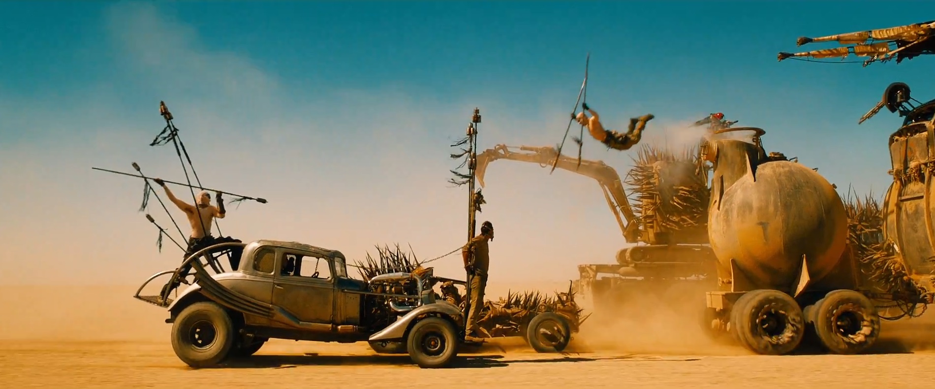
Most Inventive Use of Teal and Orange: Mad Max: Fury Road, John Seale, A.S.C. A.C.S.
The work of DoP John Seale has always been sunny, whether it’s an ironically pleasant shine like in The Talented Mr. Ripley or a scorching desert heat like in The English Patient (which won him an Oscar). But nothing compares to Seale’s positively blazing work on Fury Road. Teal and orange has been around as a predominant color scheme for a long while, but as of recently, it’s become self-parodic with how over-the-top its usage is in modern cinema. It’s as if Seale and George Miller set out to make a movie that justifies that color scheme’s existence. Unlike the lazy application of so many recent blockbusters, the characters here don’t look like Cheetos for no reason, they are living in a crazy world that is crazy hot, and they have been baking under a hot sun without water for too long. The colors make thematic sense, in addition to being so vivid that they become aesthetically gorgeous to look at (this isn’t a filter placed over a dimly-lit movie, like so many other blockbusters).
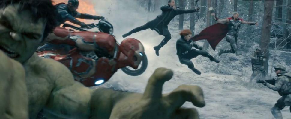
Biggest Disappointment: Avengers: Age of Ultron, Ben Davis, B.S.C.
Speaking of dimly-lit movies. Marvel’s movies are generally knocked are being stylistically homogeneous, but at least they generally look good (that’s what happens when you hire pros like John Toll, Matthew Libatique, and Seamus McGarvey to shoot your movies). Perhaps one of the best-looking of the bunch was 2014’s Guardians of the Galaxy which, befitting its out-there locations, benefits from having a truly weird and unique color scheme loaded with purples and greens and blues. That film’s DoP, Ben Davis, was carried over to shoot Age of Ultron, but sadly, lightning did not appear to strike twice. While Joss Whedon appears to be more comfortable with how to move the camera than he was directing the first one, relatively important things like color usage appear to be out of his grasp. People mocked Man of Steel (very rightfully so) for being so goddamn colorless, but really, this suffers from the same problem. The lighting is pretty drab and bland throughout, and those exciting colors from Guardians are MIA here, and we’re left with muted greys and beiges in their place. I guess you could spin the dim cinematography by saying that it follows suit with the movie’s “darkness”, but it’s not even really that dark a movie, it’s still 98% about superheroes beating up bad guys and quipping. The look here just suggests a complete lack of imagination, and from the imagery in the trailers and ads, it looks like Ant-Man may follow suit.
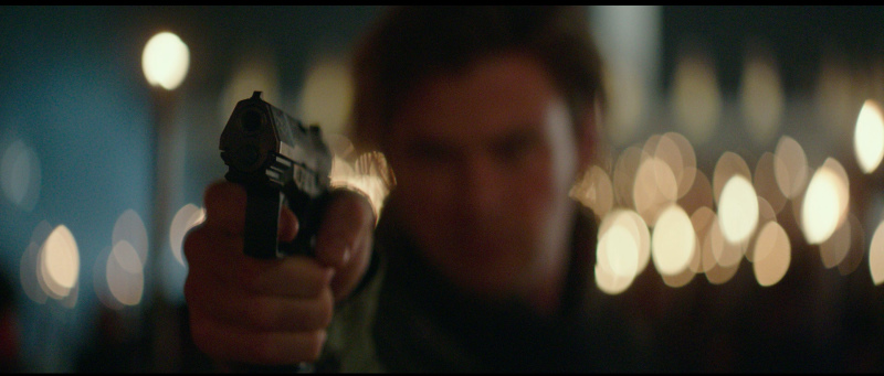
Best Use of Digital: Blackhat, Stuart Dryburgh, A.S.C.
Now that digital has basically overtaken film as the format of choice for filmmakers, it’s trying to look more like film. In fact, it’s getting increasingly harder to tell an image shot on film and an image shot on a good digital camera (the ARRI Alexa being the number-one go-to for film-esque images) apart. But many directors don’t want to use digital like they would use film, they want to use digital because it can get things that film cameras can’t. These directors include David Fincher and Steven Soderbergh, but the trailblazer in this regard is Michael Mann, who started using digital all the way back in 2001 with some portions of Ali and has since become perhaps the format’s most incredible artist. Just one look at how the LA night sky looks in Collateral would be enough to convince even Quentin Tarantino that the format has potential. The use of digital on Mann’s latest film Blackhat makes sense just on a thematic basis, given that it’s the newest filmmaking technology being used on a film entirely about new technology, but it’s an even better choice aesthetically. There are few things that can be duller on film than watching someone type on a computer, so a story largely about people typing on computers needs someone who can craft genuinely exciting imagery out of that, and Mann is the right man (haha) for the job, using (seemingly) natural lighting and a handheld technique that makes the images look like they were taken from the best camcorder in existence (this is a good thing). And that approach works even better in the fight scenes, where Mann and his DoP Stuart Dryburgh (who previously shot Mann’s pilot for the short-lived HBO series Luck) throw the camera in the middle of the ruckus and keep things coherent enough that we know what’s going on, but also shaky enough that the audience feels the extent of every blow. I can only hope this didn’t kill Mann’s career and he gets to use digital to its fullest extent in later films.
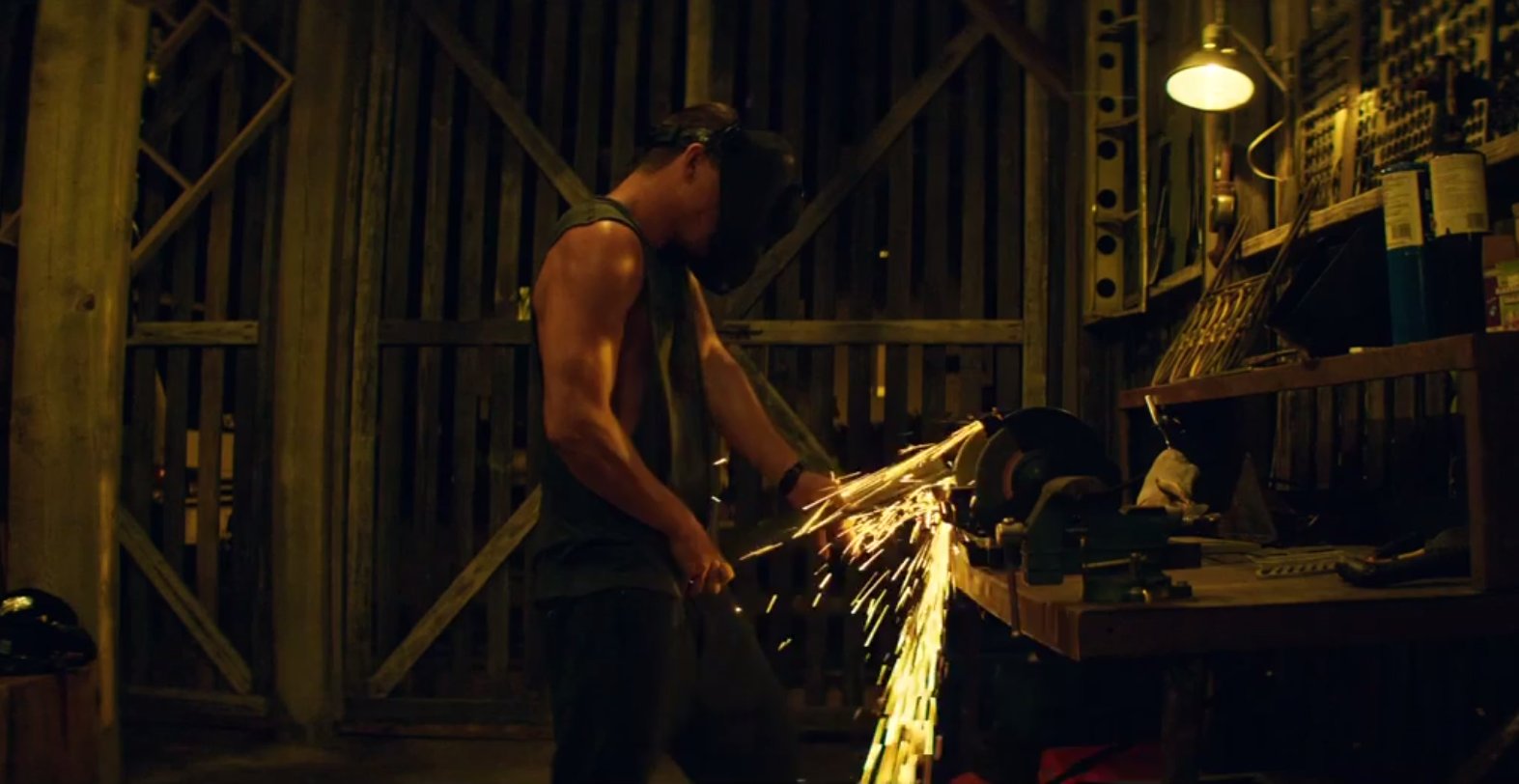
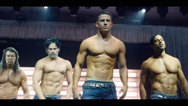
Bester Use of Digital: Magic Mike XXL, Peter Andrews
Of course, Michael Mann looks an old man trying and failing to shoot his grandson’s graduation from middle school next to Steven Soderbergh. Anyone who thinks digital will never catch up to film in terms of image quality should watch Che and shut the fuck up. And this may be Soderbergh’s most beautifully-shot film since Che. Digital has freed Soderbergh up to work entirely in natural light, and oh, what light he’s working with here. The lights in the film’s locations frequently cast the images in one brilliant shade of color before doing it with another. There aren’t many movies that are this gloriously colorful outside of Vittorio Storaro’s oeuvre. But what really makes the film sing is the shot composition. Soderbergh (and director Gregory Jacobs) position actors and objects so that they can completely fill the 2.35:1 frame, which is not a new trick for Soderbergh (he did the same thing in The Underneath, Che, and the “penis pump” scene in the original Magic Mike), but here it takes greater prominence than it ever has before. Even if Soderbergh is just shooting a scene where the former Cock-Rocking Kings of Tampa are talking to each other, the actors will fill the frame in a way that would render the shot unusable in 1.78:1. Steven Soderbergh is dead, long live Peter Andrews.
And now, smaller awards
Best Use of Film Grain to Differentiate Between Timelines: Love & Mercy, Robert Yeoman, A.S.C.
The “Eat Your Heart Out, Lubezki” Award for Best Use of Long Takes: It Follows, Mike Gioulakis
The “Just Because it’s a Serious Movie Doesn’t Mean You Can’t Put a Little Effort in Making it Look More Than Okay” Award: Still Alice, Denis Lenoir, A.S.C. A.F.C.
Purtiest Colors (Non-Soderbergh Division): Jupiter Ascending, John Toll, A.S.C.
The “Sometimes Formally Bland” Award: Going Clear, Sam Painter (w/ Maryse Alberti)